Explore Collections Explore The Collections
You are here: CollectionsOnline  /  Drawings

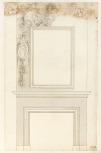
Five 'early' presentation designs for chimney-pieces, mainly in grey wash

1689
All five drawings in this group (110/32, 35, 36, 37 and 38) are predominantly in grey wash and show the complete fire surround in a careful ruled technique, which includes full definition of the architrave frame around the fire surround and the cornice of the mantel shell. All the mantel shelf cornices are the same type, with a cove beneath the corona moulding. A distinguishing stylistic feature of this group is the absence of clear definition of cast shadows: they are applied in a generalised way, as a darkish shaded area behind the elements of relief, and although there are some sharper areas of shading in places (as behind the fronds on this elevation) the effect overall is a lack of a clear sense of depth and relief. As well-defined shading appears in all Gibbons's more ambitious and freer chimney-piece compositions (e.g. section 6/5 no. 2; 110/25), and in those that must belong to a later phase, by virtue of their reduced designs and much looser pen technique, it is reasonable to conclude that this group of five mainly grey-washed designs belong to the earliest phase of Gibbons's designs for chimney-pieces at Hampton Court.

The drawing technique may be compared with that on Gibbons's design of May 1989 for the Jeffrey wall tablet at Clifton-on-Teme, now in vol. VI of the Patrington collection of MSS on Worcestershire in the Society of Antiquaries (see Thurley 2003, Fig. 159). This has no cast shadow around the edge of the monument, behind the head of the winged putti either side the pedestal above the cornice, and behind the drop of flowers at the base of the tablet, even though these features were intended to stand well forward of the wall. The only cast shadow around the periphery is behind the fronds that hang from the soffit of the tablet (compare the fronds in the side drops of this design and beneath the portrait frame in 3; 110/36). Moreover, the putti on the tablet design have long, feathered wings, like those on 5; 110/38. By contrast, on the strongly shaded coloured-washed drawing on 6/5, no. 4 (110/39), the wings are much shorter and the heads have curly rather than straight, flaxen hair.

All five drawings are on identical paper, with a watermark of an ornamental Fleur de Lys over a 4WR motif, and the countermark monogram of Piet van der Ley (combined PVL), denoting Van der Ley's paper mill at Koog aan de Zaan, Holland (from 1674 onwards). It is a stout, cream-coloured laid paper, suitable for presentation rather than sketch drawings(see English Baroque architectural drawings / Introduction). In the sketch designs closely related to these presentation designs, a thinner paper is used (see section 6/3).
Architectural & Other Drawings results view
Select list view result
Select thumbnail view result
Architectural & Other Drawings results view
Select list view result
Select thumbnail view result